Video Content Formats That Drive Developer Signups
Developers skip marketing videos but watch tutorials showing real products solving actual problems.

Summary
Developers skip marketing videos but watch tutorials showing real products solving actual problems.
Developers don't watch marketing videos. They watch useful videos. That distinction sounds small, but it changes everything about how you approach this.
The formats that actually drive signups for developer tools share a few traits: they show real things happening, they get to the point fast, and they let a developer mentally simulate using the product before ever creating an account. Everything else gets skipped. Not abandoned after 30 seconds. Skipped. There's a difference.
And these are not the same priorities as general B2B video. General B2B cares about emotional narrative arcs and broad relatability. Engineers filter that stuff out almost reflexively. Content that feels produced for a general audience gets closed before it gets a fair shot. That's not cynicism. That's just how developers process their time.
The thing worth understanding about where developers find products now: AI-generated answers are doing a lot of the pre-filtering. They're not stumbling onto things the way they used to. So whatever earns their direct attention has to clear a higher bar.
Meanwhile, DevRel teams aren't measured on views anymore. They're measured on activation. Time-to-first-API-call. Activation rate within seven days. That's what "converting a developer" actually means.
When video works for this audience, it's usually because it does a specific job: it replaces the first ten minutes of a trial. It lets someone mentally simulate the product before signing up. Technical depth. Low friction. The product doing what it claims, without heavy scripting or polish hiding the rough edges. Those are the things that matter. And none of them are accidental.
Animated explainers work best as top-of-funnel trust builders, not closers
Most companies already use explainer videos. So the format itself isn't the differentiator anymore. What you do with it is.
Shorter animated explainers, somewhere in the 60-to-90-second range, have the highest completion rates among promo formats. And completion matters, because a developer who watches to the end is forming an opinion. One who bails at the 40-second mark didn't get there.
Dropbox is the example that gets cited constantly, and it gets cited constantly because it actually worked: a simple animated explainer on their landing page drove signups from 5,000 to 75,000 per day. File sync across devices is genuinely abstract when you try to describe it in words. Clean animation made it click. DigitalOcean's App Platform explainer pulled millions of YouTube views while lowering cost per acquisition by making cloud infrastructure feel approachable rather than intimidating.
Both cases make the same argument: animation earns its place when the product concept is hard to show. Infrastructure. Auth flows. Background processes. Things that don't have a satisfying interface to point a camera at.
The risk for developer audiences is staying too abstract. An explainer that lives at "deploy in minutes" without technical specificity is a gift box with a bow on it and nothing inside. Credibility drops the moment developers sense they're being sold instead of informed. The explainer needs to answer "what problem does this solve" with enough specificity that someone actually believes it, not just nods politely and moves on.
Best use: awareness stage, landing page, paired with something more substantial further down the page. Trust builder. Not a closer.
Product demo videos convert developers who are already interested — if they stay concise
This is where interest becomes intent. A developer watching a product demo is already past "why does this exist." They're asking "does this do what I need it to do, in a way that fits how I already work?"
That's a much more specific question, and the video has to answer it directly. Demos in the one-to-two-minute range retain most viewers to completion. Demos over five minutes lose a significant chunk before they're done. Viewers are making that call in real time, and they're not polite about it.
Stripe's product tour works because it shows clean code patterns alongside actual product behavior. Modular checkout components. Tax compliance logic. Technical specificity paired with enough context that a developer can see themselves using it. Loom demoing Loom is the purest version of this: the product is the format, there's nowhere to hide, and the authenticity is the whole point.
The failure mode worth naming: demos that try to cover every feature. That move signals the team doesn't know which features matter. For a developer evaluating one specific use case, a sprawling feature tour doesn't help. It leaves them with more questions than they started with, which is worse than no demo at all.
Placement matters too. Landing pages and product pages can support something in the 60-to-90-second range. Email follow-up should be shorter. The developer clicked through from somewhere. Don't make them work to find the thing they came to see.
Interactive demos shift the experience from watching to doing — and the conversion data reflects it
Interactive demos aren't video in the traditional sense. They're guided, clickable walkthroughs of the real product. And they've moved quickly from novelty to expectation in technical SaaS.
The mechanic that matters for developers is that they can jump straight to the workflow relevant to their use case. No scrubbing through a linear video hoping the relevant part shows up. For someone who already knows what they want to evaluate, that's a real improvement, not a marginal one.
There's also a structural problem with passive video for developer tools that doesn't get enough attention. If the UI changes, the video is outdated. A button label shifts. A configuration step gets simplified. Suddenly the video is quietly lying about how the product works, and nobody's scheduled a reshoot yet. An interactive demo can be updated without rebuilding anything from scratch. When you're shipping fast, that matters more than it sounds.
The connection to product-led growth is direct. Most SaaS buyers prefer self-service trials over sales demos. Interactive demos are the closest you can get to a trial without requiring signup. They lower the activation threshold. For developer tools where the "sales cycle" is often a solo engineer evaluating something over a weekend, shortening that evaluation matters.
The honest tradeoff: these take more production effort and ongoing maintenance than a video. They're best suited for mid-funnel product pages and outbound sequences. Not top-of-funnel discovery.
Short-form tutorial and code walkthrough videos are the format developers seek out themselves
This is the most important format for developer tools. It's also the most underestimated, especially by marketing teams that have spent time in traditional B2B.
Low production polish. High technical credibility. A developer recording their screen and walking through a real integration is more trusted than a produced brand video with motion graphics and a professional narrator. That sounds backwards if you've worked in B2B content for a while. In developer-focused work, it's just how it is.
The content that actually performs looks like this:
- "How to connect X to Y in under 10 minutes"
- "What happens when this API call fails"
- "Building a working integration from scratch"
Specific. Reproducible. Tied to a real task someone is trying to do right now.
The key difference from demos: tutorials are developer-voiced. The presenter shares their actual workflow, including the parts where they pause or backtrack or make a small mistake and fix it. That's what makes them credible. Watching someone who actually uses the tool work through a real problem carries more weight than a polished voice-over explaining what to click.
YouTube is the right home for depth because it's searchable and permanent. A developer searching for the task (not the brand) can find it six months after you published it. That's a meaningfully different kind of awareness than a paid impression. They found you because you answered their question. LinkedIn short-form video outperforms text posts significantly on impression volume, with lower competition because the format is still relatively new on the platform.
The format also compounds. A library of specific tutorials indexed by use case functions as always-on discovery content. It keeps surfacing. It keeps converting. It doesn't go stale the way a campaign does.
How to decide which format to use and where in the funnel
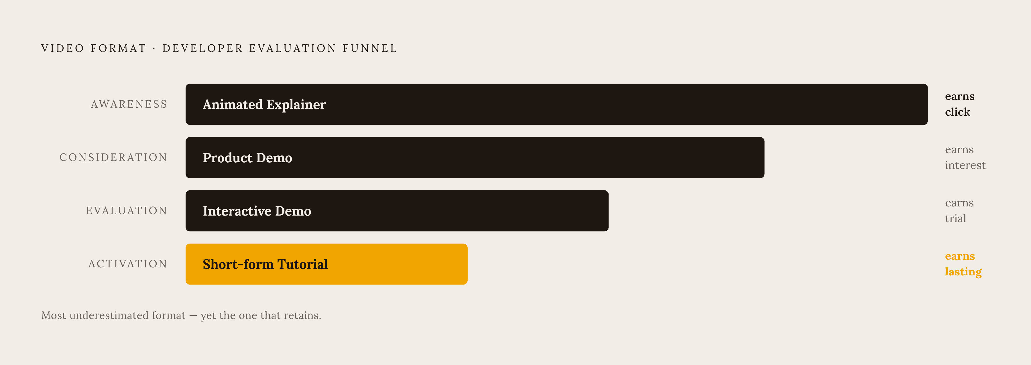
Format selection comes down to two things: where the developer is in their evaluation, and how complex the underlying product concept actually is.
Animated explainer. Awareness stage and landing pages where the product category itself needs explanation. Use it when the concept is genuinely abstract. Skip it if the product is straightforward enough to just show.
Product demo. Consideration stage, product and pricing pages. The developer already understands the category. They need to see how this specific product behaves. Keep it focused on one or two core use cases and get out.
Interactive demo. Evaluation and activation. Mid-funnel, where someone is comparing options and wants to test a specific workflow without committing to a trial. Budget time for keeping it updated when the product ships changes.
Short-form tutorial. Discovery and activation. YouTube, LinkedIn, post-signup onboarding. This is the format that builds the ongoing developer relationship, not just the first conversion.
The most common mistake in planning these: treating them as alternatives. They're layers. The explainer earns the click. The demo earns the consideration. The interactive demo earns the trial. Tutorials earn the activation and everything after that.
What they all have in common when they work is simpler than it sounds. They respect the developer's time. They demonstrate instead of describe. They make the path from "watching this" to "trying this" as short as possible. That's really the whole job.