What to Put in a Fundraising Video and What to Leave Out
The four-part structure that turns viewers into donors.

Summary
The four-part structure that turns viewers into donors.
A fundraising video is not a mini-documentary, and it is definitely not a commercial. It is a tool for turning viewer attention into actual donations, and most nonprofits build that tool incorrectly by misunderstanding what donors need to feel before they give. According to herenow.film research, watching one of these videos makes someone 48% more likely to give, and 72% of viewers describe themselves as "very likely" to donate afterward.
That gap between the videos that convert and the ones that don't almost never comes down to camera quality or production budget. It comes down to what content goes in, what gets cut, and the precise order in which information and emotion are delivered to someone who arrived as a stranger and needs to leave as a donor. Nonprofits that treat fundraising video as a general awareness exercise consistently underperform compared to those that treat it as a structured persuasion format with specific rules governing story, pacing, and calls to action.
The four elements every fundraising video needs
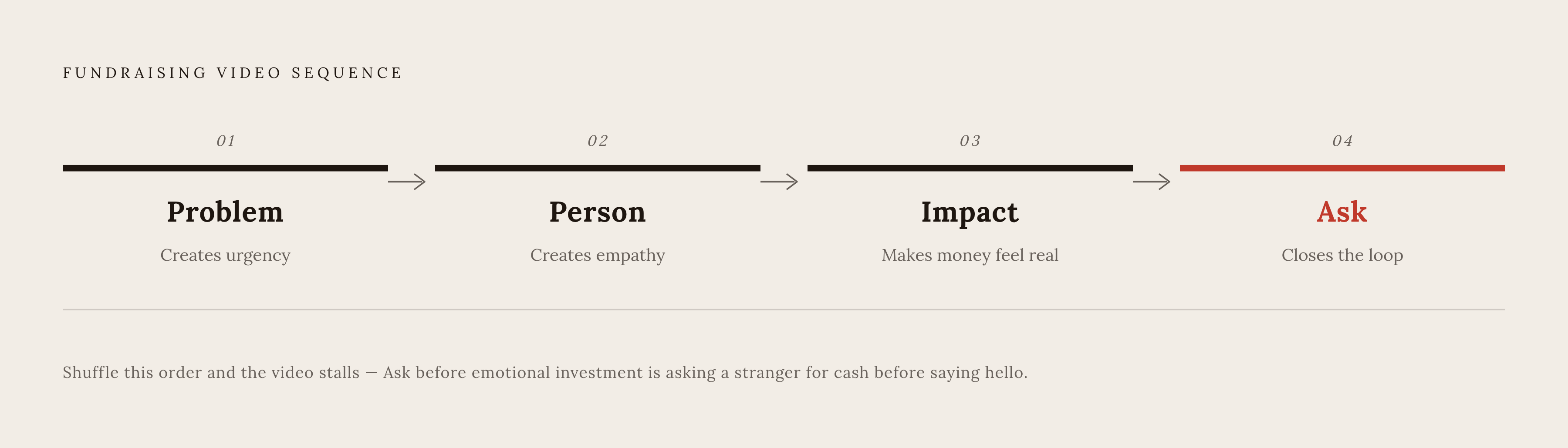
Four things, in this order: a real problem, a real person, visible impact, a specific ask. Problem, Person, Impact, Ask. Storyboard the whole thing before anyone touches a camera.
Each piece does a job the others cannot. The problem creates urgency. The person creates empathy. The impact makes the money feel real. The ask closes the loop, so the viewer knows what to do with the feeling the video just handed them. Shuffle that order and the video stalls. Lead with the ask before anyone is emotionally invested, and a stranger is being asked for cash before they have been given a reason to care. Show impact before the viewer understands what was broken in the first place, and the impact means nothing because there is no baseline to measure it against.
Emotional storytelling is not a nice touch layered on top of this structure. It is the engine. Videos that lean into it consistently see a meaningful lift in donations. The four-part scaffold exists to give that emotion somewhere to land. Which raises the obvious follow-up question: who counts as "the person," and how do you introduce them without the whole thing collapsing into a group photo?
Why one named person beats everyone else
Pick one person. Name them. Put them on camera. That is the entire instruction, and most nonprofits still undermine it by trying to represent every population they serve at once, which flattens all of them into nobody.
This is a substantive strategic choice rooted in how people actually decide to give. Research has found that people give more readily to one identifiable person than to a faceless statistic or a crowd, a pattern researchers call the identifiable victim effect. Studies into storytelling and giving have found that character-driven narratives activate emotional responses tied to trust and bonding, and donors who connect through story tend to give more and stay engaged longer. People remember stories up to 22 times better than they remember facts and figures, which means the story format is not just emotionally effective but also the primary mechanism through which your message gets retained.
Compare "over 10,000 families are food insecure" to "Maria, a single mother of two, who worries every night about feeding her kids." The first is a statistic nobody pictures. The second is a specific woman in a specific situation, and only one of them moves a viewer toward a donation decision.
The instinct to be fair to every group a nonprofit serves is exactly what makes fundraising videos forgettable. One protagonist, named, on screen, inside the first fifteen seconds is not a soft guideline. It is the rule.
What your opening fifteen seconds must do
The first three to five seconds decide whether anyone sticks around for the rest. That is the actual window, and the most creative energy should go there.
What works: a face mid-emotion, something raw enough to bypass analytical thinking and land directly on feeling. A question that creates tension. A visual that does not resolve immediately, so the viewer keeps watching to find out what they are looking at.
What consistently kills the opening is the institutional throat-clear: the logo, the mission statement read solemnly over stock footage, a slideshow of program photos, a title card announcing the founding year. All of it signals "institution" at the exact moment the viewer has not yet been given one reason to care about an institution. Hook first, context later. The nonprofit's name, its history, and its service area can all wait until the viewer is already emotionally engaged. Studies show drop-off happens inside the first ten seconds, which means the opening carries the full weight of keeping the viewer in the video at all.
How to build momentum through the middle
Once the hook lands, the middle has one job: keep the story moving without losing the thread. The arc is straightforward. Meet the person, understand the struggle, watch the change happen, and see the donor's role in that change made explicit.
That last part carries more weight than it might appear to. The donor needs to understand that they are the reason the outcome happened, not a passive observer watching a nonprofit do good work from a distance. Only after that connection is established does the video earn the right to show organizational detail, specifically what the program does and how the intervention works.
Specificity is far more effective than vagueness here. "$50 provides a hot meal, $200 covers four nights of shelter" gives a viewer something concrete to act on. "Your gift helps people in need" gives them nothing actionable. Real beneficiaries and real staff speaking candidly on camera tend to read as more credible to donors than polished, scripted testimonials because authenticity functions as a conversion mechanism, not just a tone preference.
One exception deserves to be named clearly: some causes involve beneficiaries for whom appearing on camera could create real danger. In those cases, reenactments can communicate the story just as effectively without putting anyone at risk.
When and how to place your call to action
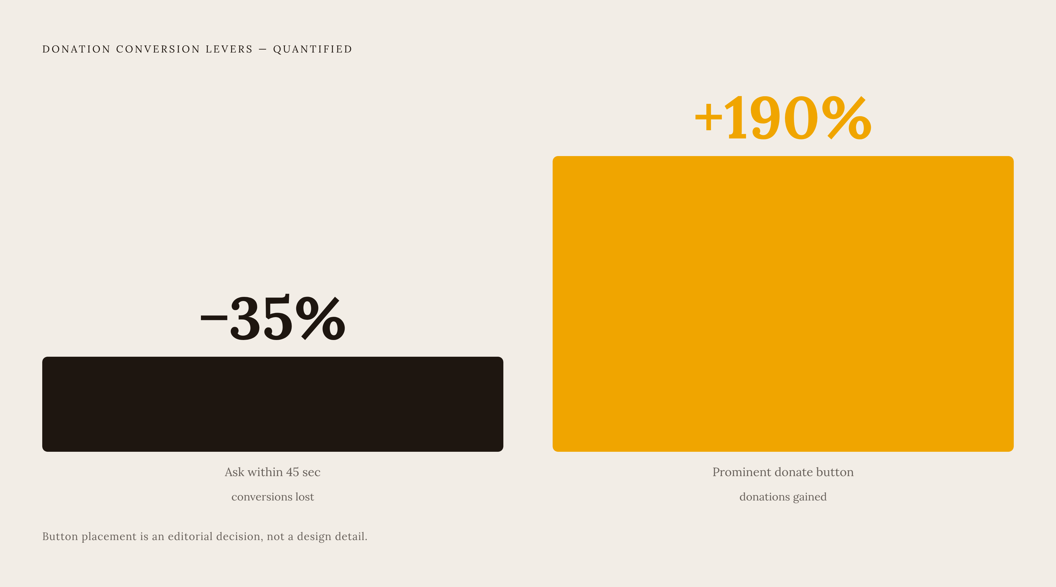
Waiting until the last ten seconds to ask for money is a habit, not a strategy. Skipping the donation ask in the first 45 seconds can cut conversions by 35%, according to Happy Productions research. The ask belongs early and it belongs more than once. It does not get saved for the final moment.
Visibility matters just as much as timing. Making the donate button prominent rather than buried can drive a 190% increase in donations, according to 360MatchPro data cited by Wild Apricot. That is an editorial decision with a direct line to revenue, not a cosmetic preference.
A strong call to action answers four questions before the viewer has to ask them: why is this money being raised, where does it go, when does the campaign end, and what does the viewer do right now. One action per video. Donate, share, volunteer, sign: pick exactly one. Presenting multiple options is a reliable way to produce no action at all, because a viewer given three choices typically selects none of them.
One technical detail worth addressing: embedded video breaks in Gmail and Outlook. Host the video on a dedicated platform and link out from a play-button thumbnail placed directly beside the donation form. Urgency, whether a deadline, a matching gift, or a named crisis, belongs inside the call to action at the close, not distributed throughout the video. Stated once at the end, urgency reads as a decision point. Stated repeatedly throughout, it reads as noise, and viewers disengage from noise quickly.
Content that hurts more than it helps
Some content does not belong in a fundraising video regardless of how much organizational pride sits behind it. The most common offender is the self-portrait: history, awards, staff structure, and mission language that signals institutional pride rather than human need. Institutional pride has never been the mechanism through which a donor decides to give.
Adding a second protagonist does not double the emotional impact. It divides it. One person, one struggle, one outcome, one ask is the entire structure, and every additional storyline reduces the effectiveness of what is already there.
Data overload is its own problem. "18,000 people served last year" tells a viewer nothing about whether their $50 matters today. A single specific human outcome does more persuasive work than any volume metric. Sensationalism creates the opposite kind of damage: presenting the most extreme case available as representative of typical need may generate a short-term emotional response, but it erodes donor trust over time. Fundraising ethics guidance widely treats that approach as both a strategic error and an ethical one because they turn out to be the same mistake with different consequences.
Most over-stuffed fundraising videos trace back to organizations treating each video as their only opportunity to communicate everything. The solution is a sharper edit that makes deliberate choices about what to remove, combined with a strategy that produces more videos, each one narrower in focus, so no single video has to carry the entire organization's story.
What drop-off data says about video length
At the two-minute mark, without a story actively pulling its weight, viewers leave in large numbers, with a 53% drop-off rate according to Happy Productions research. Past that point, viewers are not being educated further. Their patience is being tested, and patience has a short shelf life in a digital environment full of competing content.
Fundraising video performs best in a range of roughly 90 seconds to two minutes. Asking someone to part with money requires more emotional investment than a quick explainer, but that investment will not stretch beyond two minutes of undivided attention for most viewers. Benchmark data shows videos under one minute at meaningfully higher average engagement rates, and the trade-off is direct: shorter videos get finished by more people, longer videos allow more room to develop the emotional case, but no single video can fully optimize for both.
For time-sensitive campaigns such as disaster relief or year-end matching deadlines, go shorter. Under 60 seconds, lead with the specific dollar amount and its impact, and prioritize shareability. If the subject is too complex for that window, do not force it into one video. Break it into a series and distribute it across the campaign calendar. Cutting a video to 90 seconds is an editorial judgment about what the video is actually about, followed by removing everything that addresses something else.
Captions, format, and platform decisions that matter
None of the storytelling work matters if the video is never watched, and the decisions that determine whether it gets watched are mostly unglamorous and easy to deprioritize when deadlines are close.
Captions are the most important of these decisions, and skipping them is the single most common avoidable error in this process. Adding subtitles meaningfully increases viewership, and video without captions is far less likely to be watched completely by deaf and hard-of-hearing audiences. Most people scroll social feeds with sound off, which means captions are the only mechanism through which the emotional arc of the video survives autoplay on mute. They are not an accessibility checkbox added at the end of production. They are a core distribution requirement.
Format must match the platform: vertical for Instagram and TikTok, square for Facebook. Ignoring this causes the algorithm to reduce the video's reach regardless of content quality. Placement matters as much as format: video placed directly beside the donation form, or linked from a thumbnail inside an email, consistently outperforms video hosted on a separate page behind a generic link. On the production side, film during actual program activity rather than staged recreations where avoidable, finish editing well before the video is needed, and account for how compressed nonprofit calendars become during peak campaign periods.
What high-performing fundraising videos share
None of this is theoretical. It appears consistently in the videos that actually convert viewers into donors.
GRID Alternatives' "Access Clean California," produced with Vidico, opens on Alma and her family and their specific problem around transportation costs before the mission statement appears. Character comes first, cause comes second. First Descents, per Zeffy, films young adult cancer survivors during outdoor adventures and allows the visible joy and transformation on screen to carry the entire emotional argument for giving without narrating over it.
UNICEF's "For every child," per Zeffy, opens on concrete lived problems including children without food, healthcare, and physical safety, and pulls viewers into urgency before the organization's name appears, then distributes the video in format-specific versions across platforms. Hello Sunday Morning, per Vidico, uses animation to make a difficult behavioral health topic approachable, and the hand-drawn visual style reads as personal rather than corporate, which matters because polish can make donors suspicious of a fundraising pitch. Girl Effect's "The clock is ticking," per Zeffy, runs the same structural playbook in an advocacy context, walking viewers through vulnerability and landing on a clear action that is not a donation ask at all, which demonstrates that the framework holds even when the specific ask changes.
Five different videos from five different organizations sharing one underlying structure: a single subject, emotion established before explanation, a visible outcome, and one clear action at the close. The best-performing fundraising videos keep converging on this structure whether the organizations behind them planned it deliberately or arrived at it through iteration, because the structure reflects how donation decisions actually get made.