Animated Diagrams vs Live Code in Technical Videos
Choose animated diagrams to explain invisible concepts, live code to show how tools actually behave.

Summary
Choose animated diagrams to explain invisible concepts, live code to show how tools actually behave.
The debate about animated diagrams versus live-code screencasts is mostly a fake debate; creators spend real energy on it. "Which looks more professional?" "Which gets more views?" "Which takes less time to produce?" Those are all reasonable questions. But none of them are the right question. The right question is simpler: what does your viewer need to walk away being able to do, and is that thing visible in a real environment? Answer that honestly, and the format picks itself.
How each format routes information through the learner's working memory
Here's the cognitive reality, and it's not complicated once you see it.
Your viewer's working memory has two channels. One handles audio. One handles visuals. Narration paired with visuals uses both channels in parallel. On-screen text paired with visuals competes on one channel. That's the core finding from Mayer's Cognitive Theory of Multimedia Learning, and both formats live inside that constraint whether the creator knows it or not.
Animated diagrams give you significant control over what hits those channels and when. You decide what appears on screen. You decide when it appears. You set the pace. The extraneous cognitive load (the mental effort that doesn't contribute to learning) is largely a design decision. Get that design wrong and you overwhelm your viewer. Get it right and the format can carry genuinely complex ideas cleanly.
Live coding is a different story. The format can reduce extraneous load by presenting code incrementally, building up a solution piece by piece instead of dumping a finished block on screen. But that benefit depends entirely on the instructor's pacing. Fast typing spikes the load. An unplanned error and a long debugging detour spike the load. The format is less predictable because the human running it is less predictable — live coding, in other words, is only as steady as the hands on the keyboard.
Neither format is cognitively easier in the abstract. The question is which one keeps cognitive load manageable for the specific concept being taught. And that depends on the viewer's experience level too. A novice programmer will need the scaffolding that animation provides. An experienced developer will find animation patronizing and just want to see the code run. The research hasn't settled where that line sits, which is worth naming honestly.
What the evidence actually shows about animated video and learning
Here's where it gets a little humbling, because the research is both useful and incomplete.
A 2023 study in the British Journal of Health Psychology found no significant difference between animated video and talking-head video in knowledge gain or willingness to share information; format alone doesn't determine outcome. That's the first uncomfortable finding.
The second finding is more useful. A systematic review published around the same time found animations outperform static sequential images when the content involves dynamic events. A meta-analysis of controlled experiments confirmed that animation improved learning over static images. So animation beats a still diagram. It doesn't automatically beat other video formats.
The gap closes when the content isn't inherently dynamic. If you're using animation to explain something that can be shown just as clearly with a well-designed still image plus narration, the animation is mostly decorative. And researchers have flagged something worth taking seriously: animation encourages surface-level engagement. Motion draws attention. It doesn't guarantee that attention stays productively directed — like a shiny lure that gets the fish to bite but doesn't actually feed it.
The practical takeaway is straightforward. Animation earns its place when the concept is genuinely dynamic or invisible to the naked eye. System architectures. Data flows. Algorithm execution. Memory allocation. These are things that have no visible runtime in the real world. Animation isn't a default production choice; it's the right tool when the concept genuinely needs to be constructed visually because the real thing can't be seen.
What the evidence actually shows about live coding and learning
Live coding has a charming gap between how it feels and what it demonstrably produces.
Instructors consistently report higher student engagement during live coding compared to traditional lectures. Students interact more. They ask more questions. The room feels more alive. And then you look at the controlled studies. Research by Raj et al., Shah et al., and Rubin, spanning roughly 2013 to 2023, found that live coding has not been conclusively shown to significantly improve measurable learning outcomes compared to other approaches. The engagement is real. The knowledge transfer advantage is unproven. You could say live coding writes a lot of checks that the research can't cash.
What live coding does demonstrably model is something different. It shows incremental development. It shows debugging behavior. It shows real tool friction, the kind that happens when a package won't install or an API returns an unexpected shape. A finished animated diagram cannot show any of that. A polished screencast of clean, pre-written code can't show it either.
There's also a structural disadvantage worth naming. Most instructors share only final solutions. The intermediate steps, the dead ends, the moments of "wait, why did I do it that way?" are the most valuable parts of live coding, and they're also the hardest to recover or document. A 2024 study from Aalborg University found that live coding doesn't benefit all learner types equally, with Felder-Silverman learning style dimensions affecting how much students gained from the format.
The honest summary is this: live coding is more effective at shaping process and behavior than at transferring declarative knowledge. For some learning goals, that's exactly right. For others, it's exactly wrong.
The content-type test that determines which format belongs where
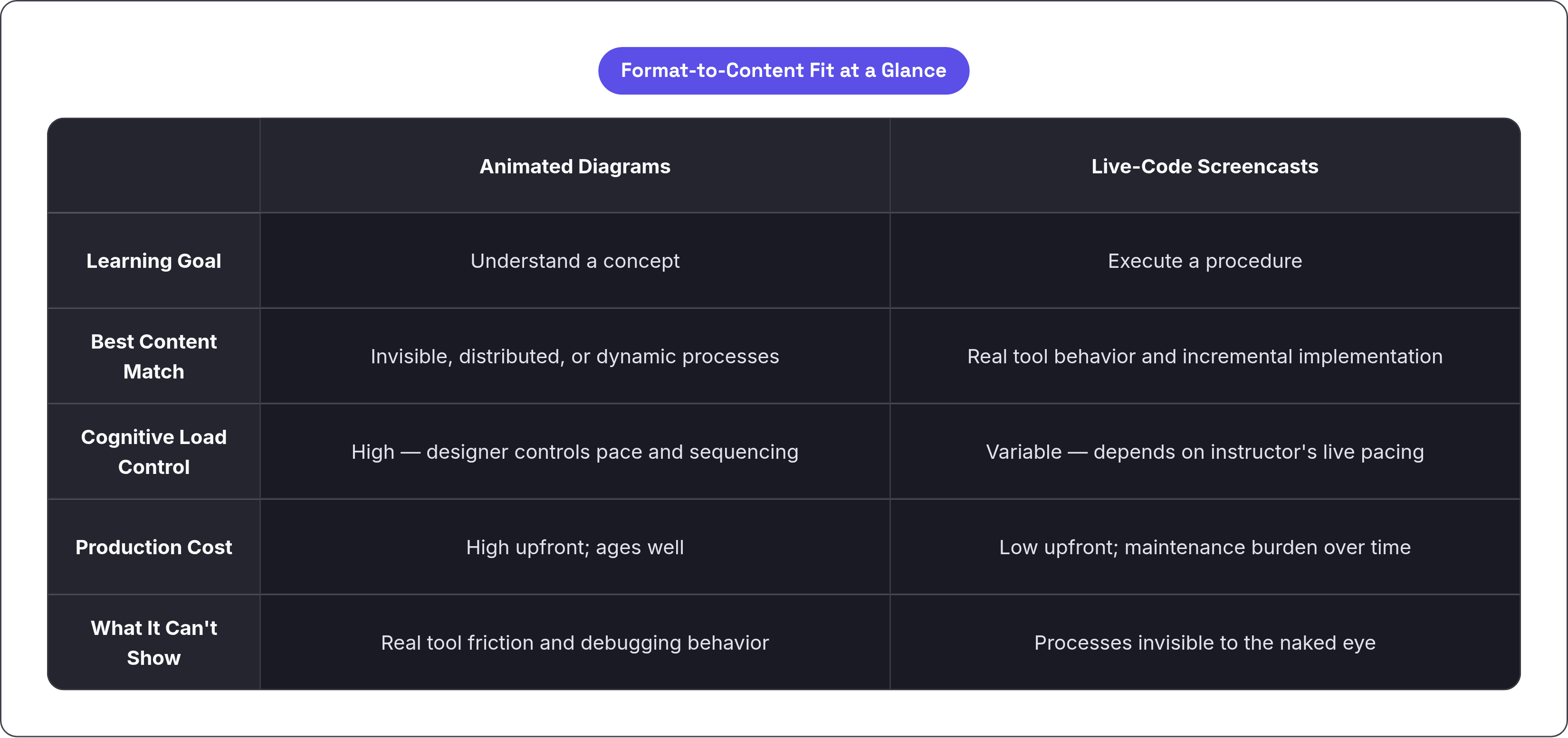
There's a single diagnostic question that cuts through all of this.
Is the viewer being asked to understand something, or to do something?
Concepts go to animated diagrams. Procedures go to live-code screencasts. That's it. The rest is application.
Animated diagrams are the natural fit for distributed system consensus, memory allocation, recursion, OAuth flows, API request lifecycles. Anything where the actual runtime is invisible, too fast to follow, or happening across multiple machines that can't all be on screen at once. These are things that need to be constructed for the viewer because the viewer cannot simply watch them happen.
Live-code screencasts are the natural fit for setting up a dev environment, implementing a specific endpoint, debugging a failing test, scaffolding a project from scratch. Anything where watching real tool behavior is itself the lesson. The viewer needs to see what happens when you run that command, not a diagram explaining that running the command causes something.
The format mismatch failures are where this gets concrete. An animated diagram tutorial for a CLI workflow is a problem because the viewer never sees the thing actually run. They get a beautiful explanation of what should happen, but no muscle memory for the real experience. A live-code screencast explaining OAuth is a problem in the other direction. The viewer watches someone type out an authorization URL while they actually needed a sequence diagram showing the redirect dance. The typing is real. The understanding doesn't follow.
Channels that implicitly get this right are instructive. 3Blue1Brown uses Manim-generated animation almost exclusively for computer science and math concepts, things that require construction to be understood. The Coding Train favors live-code screencasts for step-by-step programming instruction, things where the process is the lesson. Neither channel is trying to do the other's job.
The test isn't "which format do I produce well?" It's "which format matches what the viewer needs to leave with?"
Where a single format runs out of road and a hybrid fills the gap
Some content genuinely needs both.
The common scenario is a tutorial that must explain why an architecture works and then show how to implement it. A webhook tutorial, for example. Why does the event propagate this way? What's actually happening between the third-party service and your server? That's an animated diagram question. How do you write the endpoint handler and test it locally? That's a screencast question. Neither format covers the full job on its own.
Coursera and edX have increasingly structured platform courses this way. Animated segment explains the concept. Screencast segment shows the implementation. The seam between them is the transition, and that transition is where hybrid falls apart if it's handled poorly.
The cognitive whiplash is real. If the format shift feels arbitrary, if the viewer can't tell why you switched modes, the transition creates friction instead of flow. The switch needs to be motivated by the content. "Now that you understand what's happening, let's watch it happen" is a motivated transition. Cutting from an animated diagram to a screencast because you got bored of one or the other is not.
Fireship on YouTube is a working example of hybrid done at speed. Motion graphics explain the concept in the first half of a video. Brief, real code snippets follow. The segments are tight. The transitions are motivated. High engagement, dense information, short runtime. It's not a fluke.
Practitioners are also finding a middle path by embedding animated call-outs and diagram overlays directly inside screencasts, adding designed clarity to authentic footage without fully switching formats. That's a lower-cost version of the same logic.
Production tradeoffs creators actually face when choosing a format
Let's be honest about the real costs.
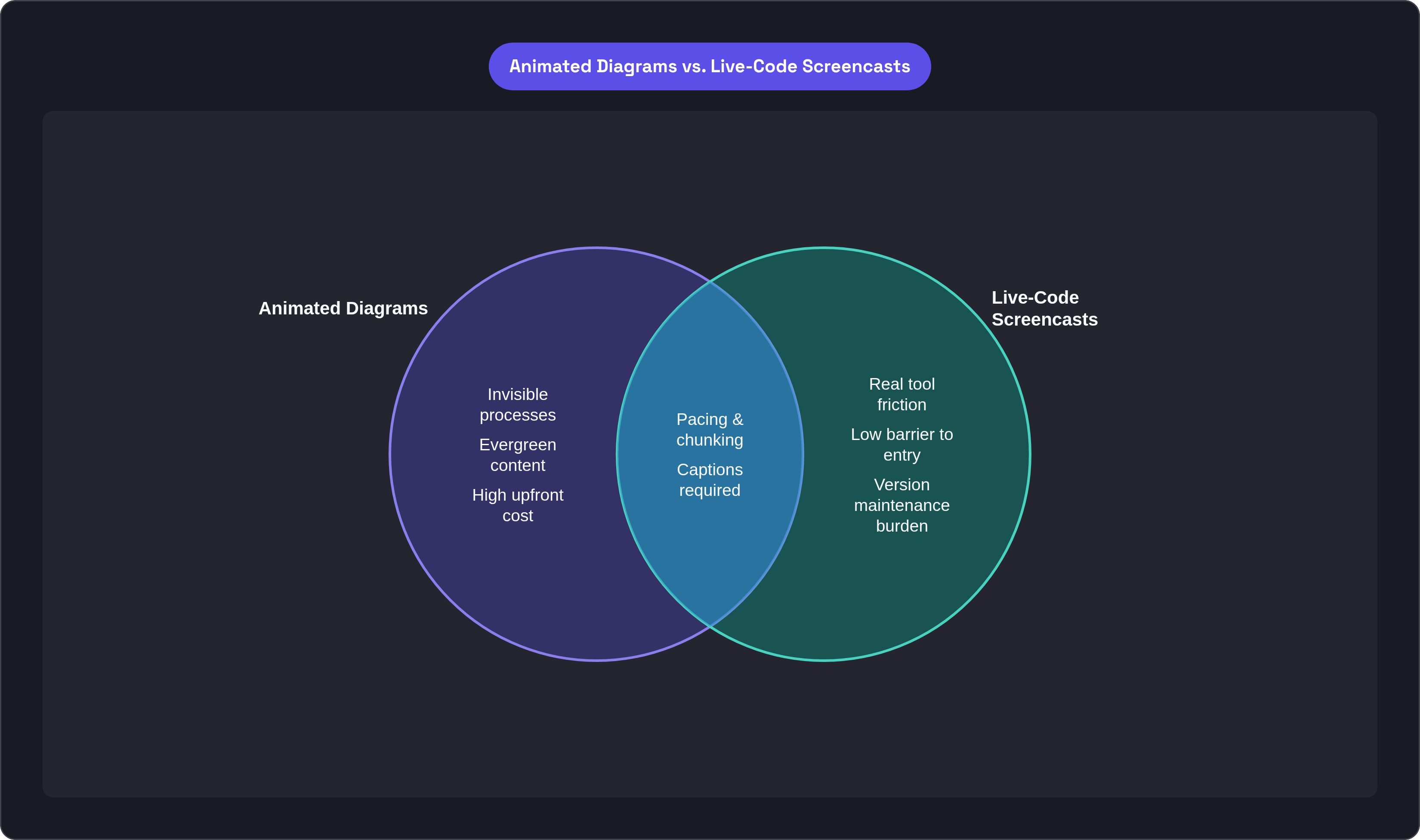
Animated diagrams carry high upfront investment. Complex motion, custom illustration, and precise narration synchronization take time and tooling. Tools like Manim (the Python library 3Blue1Brown built and open-sourced), After Effects, and Lottie each have their own learning curves and production workflows. The investment is defensible when the content is evergreen. A diagram explaining how TCP handshakes work doesn't become wrong when a new library version ships. That diagram ages well.
Live-code screencasts have a low barrier to entry. Screen recorder, microphone, an IDE. The production overhead is modest. But they carry a maintenance burden that animated diagrams mostly don't. A screencast built around a specific framework version can become actively misleading the next time that framework updates its API. What looked like a working tutorial becomes a source of confusion for viewers running newer versions. The low upfront cost can become a long-term liability.
One thing shifting this calculus right now is AI-assisted animation tooling; LLMs that generate Manim scripts are lowering the production cost of animated diagrams meaningfully. The gap between the two formats in terms of creator effort is narrowing, and that trend will likely continue through the next couple of years. Whether the output quality holds up at scale is still being worked out, but the direction is clear.
Both formats share some production disciplines that don't get as much attention as they should.
- Pacing: narration and visuals need to stay synchronized in both formats. Too fast and working memory overloads. Too slow and attention drifts.
- Segment length: chunked, shorter segments consistently outperform long continuous recordings for retention. This applies equally to both formats.
- Accessibility: closed captions and transcripts are a requirement for both formats. A baseline expectation, not optional.
Neither format gets a pass on any of these.
Matching format to content before production starts
The decision needs to happen at the content-planning stage. Choosing the format after you've already scripted the content is too late. You'll end up retrofitting, and the mismatch usually shows.
Two questions worth asking at the start, before any production decisions.
First: what does the viewer need to be able to do or explain after watching this? If the answer is "explain how distributed caching works," that's a concept, and animated diagrams belong there. If the answer is "set up Redis on a new project," that's a procedure, and a screencast belongs there.
Second: is the key process visible in a real environment, or does it need to be constructed? If you can screen-record it and the recording actually shows the viewer what they need to see, a screencast works. If the process is invisible, distributed, or too fast to follow in real time, it needs to be constructed through animation.
Format versatility matters less than format fit. A competent live-code screencast explaining a concept that genuinely needs a diagram will underperform a modest animated diagram of the same concept. The production quality doesn't compensate for the format mismatch.
One thing worth naming honestly: no large-scale controlled study has directly compared both formats for the same programming concept in the same population; creators are working from partial evidence. Treat your own viewer feedback as data. Watch retention curves. Read comments. Pay attention to where viewers drop off and what questions they ask afterward. That information is more specific to your content and your audience than any general study can be.
The formats aren't competing. They serve different jobs. A creator who can identify the job clearly will pick the right tool without needing to debate which format is categorically superior, because that debate was always beside the point.


